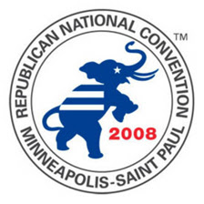
 The new logo for the Republican National Convention, unveiled this week, prompts some immediate questions:
Why is the GOP elephant Democratic blue? Are those prison stripes on its back? And -- given the convention's proximity to Sen. Larry Craig's infamous bathroom stall -- why the wide stance?
Both parties unveiled convention-related logos this week. The Republican's "triumphant elephant" faces off against Democratic Committee's seemingly Winter Olympics-themed mark, which depicts the Rocky Mountain setting for the Denver conclave while highlighting "the importance of the West to the future of the Democratic Party." (This is the committee logo; no official DNC logo has been released yet.) Relying on experts to determine if the parties succeeded in their aesthetic or communications goals with the designs, I asked Twin Cities design luminaries to weigh in. As their responses roll in, I'll post them.
 "Wait, wait, wait, is this even a logo?" So asks Aesthetic Apparatus' Dan Ibarra of the DNCC logo. "There's so much crammed in here, it's got no focus and is filled with such astoundingly awkward space and line-intersections. My favorite part is the very top arc of the last 'C' ALMOST touching that white bar... but not. It is wholly appropriate that COMMITTEE be highlighted on the bottom as this logo was definitely designed by one."
He adds: "I thought Enron's first logo was much better."
Andrew Blauvelt, design director/curator at the Walker Art Center thinks the mountain range is appropriate for the Democrats' Denver locale and "Western state ambitions," but wonders "if the number of stars alludes to the current crop of candidates," he adds. "Is Hillary brightest and Kucinich in a galaxy far, far away?"
For the Republicans' logo, Blauvelt notes the prominent "TM" to the upper right of the mark: "Why trademark something that will never be stolen?"
"While the Democrats have a constellation of stars, the Republicans offer us only one: a twinkle in the eye of the GOP's elephant. For the party always enforcing being on-message and towing the line, however, this pachyderm seems angry to me, up on hind legs as if he's taken too much abuse from his trainer."
Ibarra laments, "as bad as this logo is, it's better than the DNCC's."
"At least this one has got some focus to it. Nice under-thought type choice though, boy," he says. "But Andrew is right: What the hell is the elephant doing rearing up? Maybe elephant's rear in nature all the time -- I don't know -- but in my experience they rear either in anger (I love the violent, pro-war undertone I get with that) or because they're some trained circus elephant about to balance on a nice bright red ball (I love the 'we'll happily be manipulated to suit your needs!' undertone on that interpretation.) The latter is probably the correct intent as the thing is wearing a nice little stripy blanket."
Ibarra's last comment focuses on the lone star on the pachyderm's face.
"I don't know elephant physiology but is that star really where an elephant's eye is? It kind of looks like its cheek."
2 comments:
Maybe it got stung in the butt by a bee?
http://news.bbc.co.uk/2/hi/science/nature/7033830.stm
I hate the acronym of DNCC. Kinda sounds like one of those wimmin private parts procedures.
They ought to retitle themselves as Democrats Of America..... uh, wait a second, maybe that's not such a good acronym either.
Post a Comment